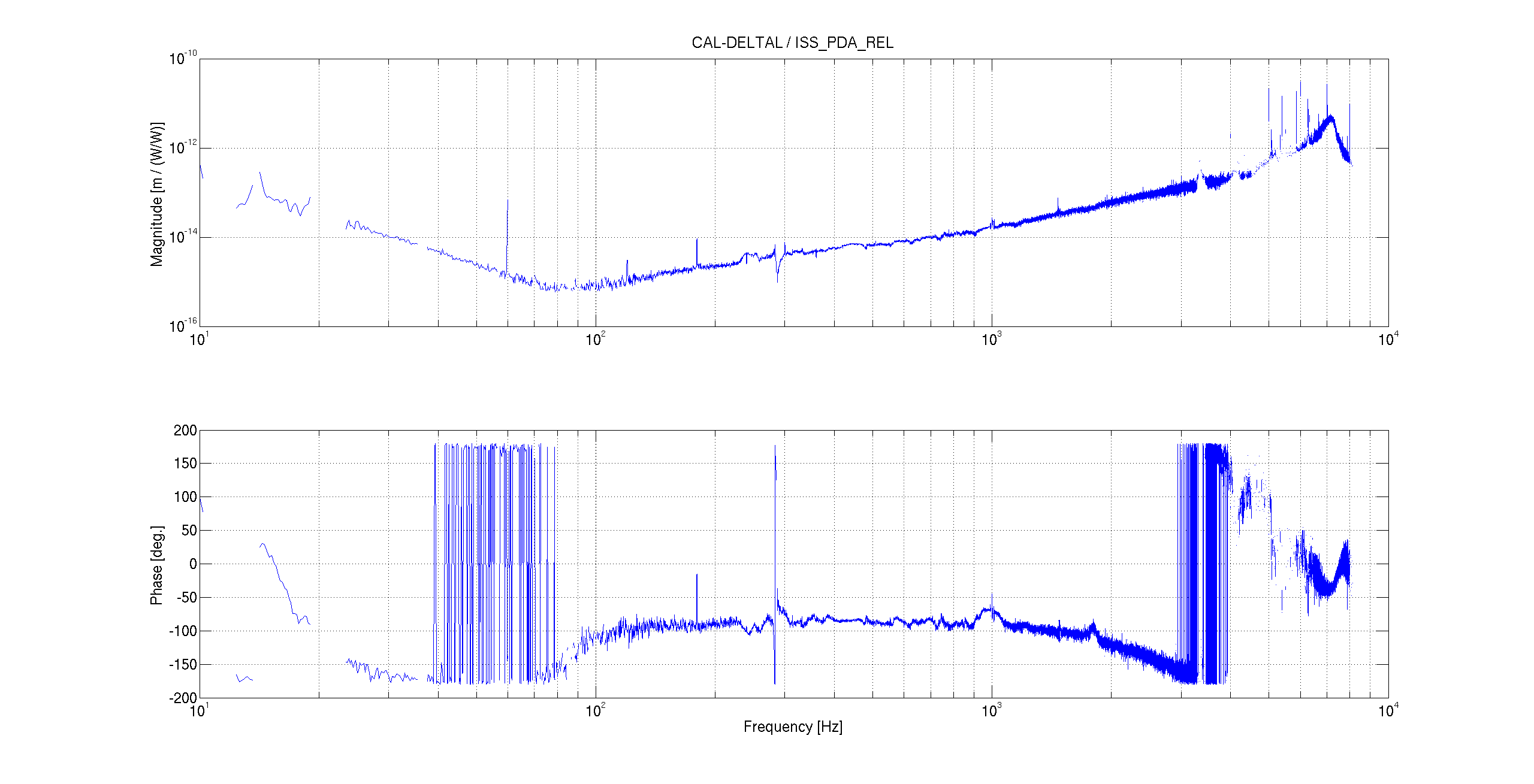
Following up on entry 30273, I computed the coherence and transfer function between ISS_PDA_REL_OUT (which should be calibrated in RIN units) and CAL-DELTAL_EXTERNAL (including the proper calibration). Coherence is good enough to estimate a transfer function over all the frequencies above 10 Hz. I'm not injecting any additional noise, just using the signals as they are, so the fact that we have coherence doesn't necessarily mean that we really have a coupling of intensity noise to DARM.
However, the transfer function has a very interesting shape (see figure). It's behaving like 1/f^3 up to ~80 Hz, and above that frequency it increases like f. The region below 80 Hz might very well be consistent with radiation pressure coupling of intensaity noise. We'll have to run some numbers to be sure that this makes sense. I have no clear explanation of the increase above 80 Hz.
Addition:
A quick and dirty estimate of the expected coupling of RIN at the ISS PDs to DARM due to radiation pressure
x = 2 deltaP / c / (m * (2*pi*fr)^2) / (fr / fr_pole_doublecav) = 2 P_arm / c / (m * (2*pi*fr)^2) / (fr / fr_pole_doublecav) * RIN
At 30 Hz the coupling should be about 2e-11 (maybe off by a factor of 2 or so due to the two arms, etc..). This is many orders of magnitude LARGER than what measured in the TF discussed above. So it is unlikely that PDA/PDB see real intensity noise that goes into the IFO.
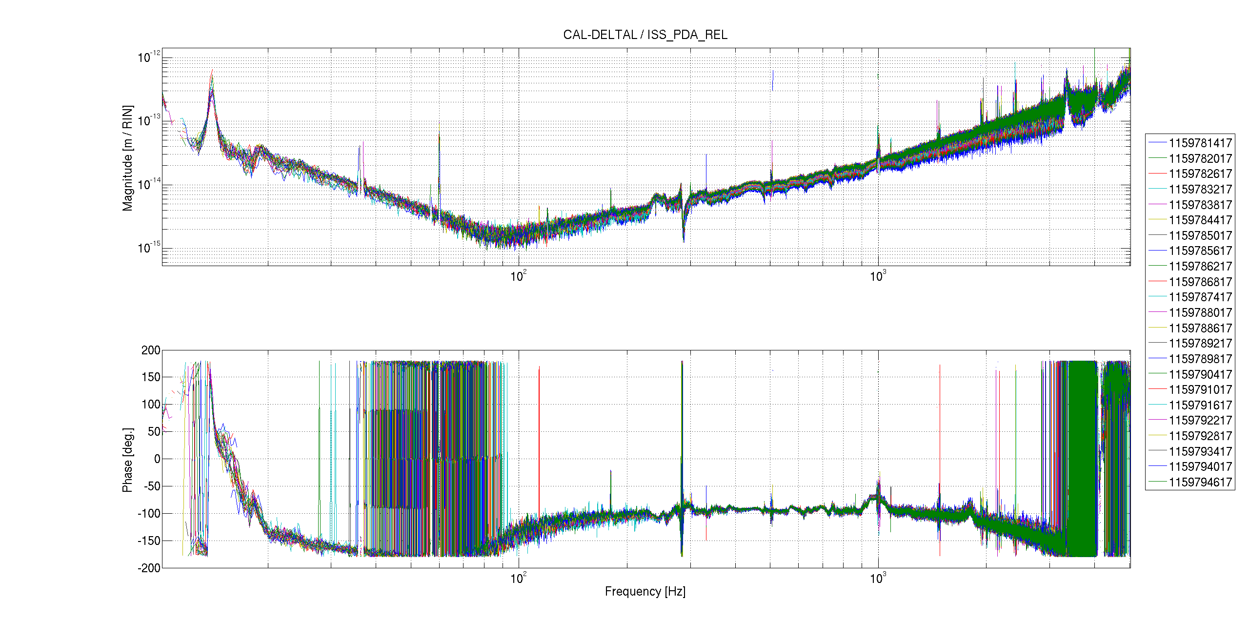
I checked how stable this transfer function was over time. I picked the lock stretch that started around GPS 1159781417, last night.
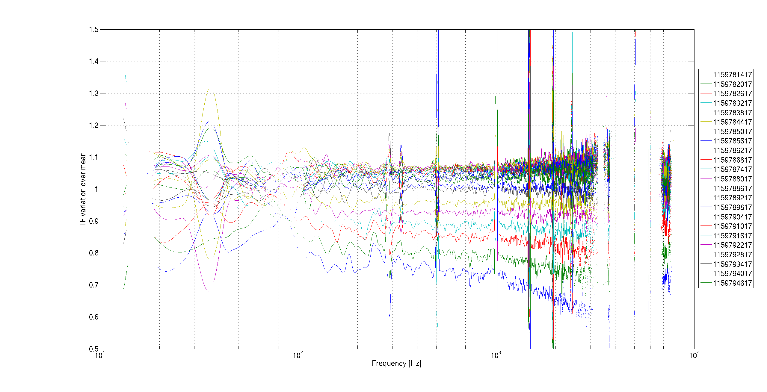
The first plot shows the transfer functions CAL_DELTAL / PDA_RIN for 23 segments, each 600 seconds long. The second plot shows the same transfer functions, but divided by the overall mean, to emphasize the variations. It's clear that there are variations up to ~40% during this time period.
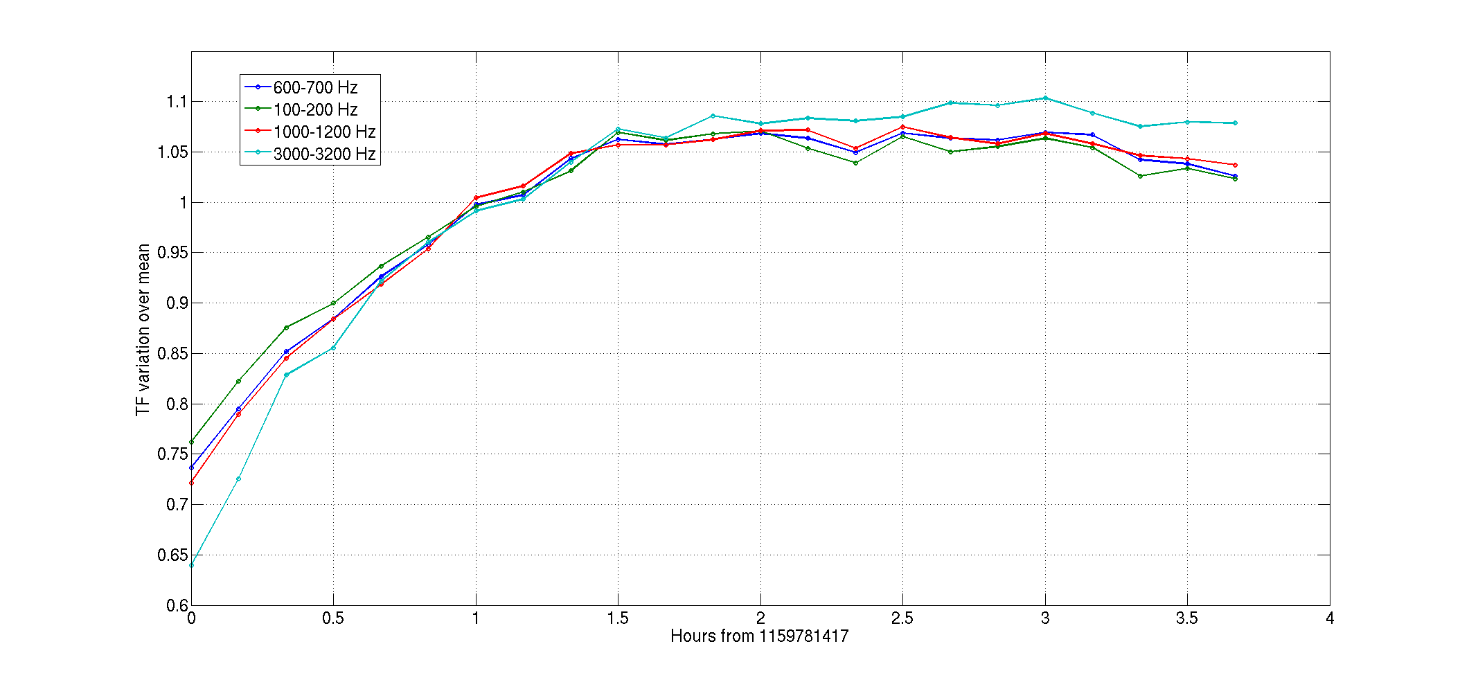
FInally, the last plot shows the value of the transfer functions averaged in four different frequency bands, as a function of time. This shows more clearly the variation and the more accentuated trend at the beginning of the lock stretch.