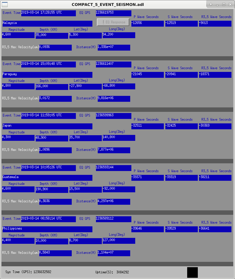
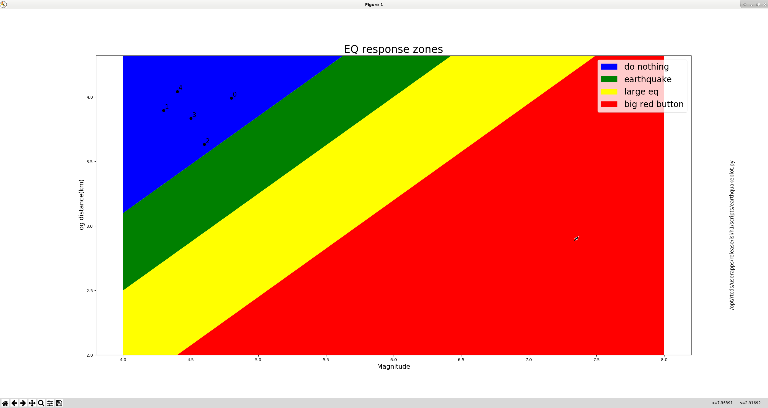
Based on my alog from a couple weeks ago about LHO earthquake responses ( here ) I've written a python script to give some rough guidance on how we should respond to an incoming earthquake. On the top middle of the Seismon screen there is now a new button that says "!EQ response" (grey button on the top middle of the first screenshot). This launches a python script that plots all of the earthquakes as on the seismon currently shows by log10(distance) from LHO and magnitude, and places each earthquake in one of 4 different response zones, second attached plot. Each earthquake is represented as a point, labeled by the seismon channel number (0-4), any earthquake that is still incoming will show up as orange. On this plot the regions are labeled blue for "do nothing", green for putting SEI_CONF in "EARTHQUAKE", yellow for put SEI_CONF in "LARGE_EQ" , and red is push the big red button.
This plot still needs adjustment, as distance and magnitude only give a very, very rough idea of how disruptive any earthquake is going to be, but I suspect all of my regions need to move a bit southeast. It's disastrously far off, as I don't think we even saw any of the 5 eqs on that plot in the site seismometers, and they all fall appropriately in the blue "do nothing" region. There are other factors this plot doesn't account for like depth, for instance, a shallow earthquake (10 km is the minimum), I think, will be worse than a deeper ( on order of hundreds of km). I didn't want to try doing a 4d plot, so the user will have to do some discounting for depth on their own. The path the earthquake takes also matters, a 6.0 in Alaska will generally be worse that a 6.0 in South America, at least for LHO.
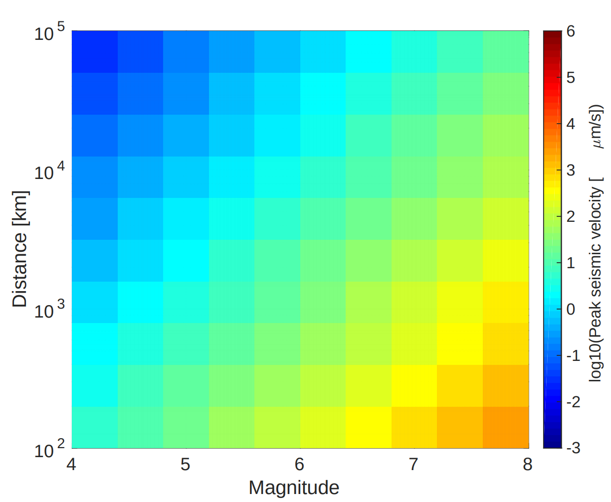
The plot my script makes is a rough fit by eye to a plot from one of seismon papers that Michael Coughlin pointed me towards, third attached image. The x axis on this plot is magnitude, y axis is the distance, and the heat scale is the log of the expected peak surface velocity. I don't have their data for that plot, so I haven't been to throw our data on top of it to see how it compares, but the general trend of closer and/or bigger is worse for us, is obviously true.