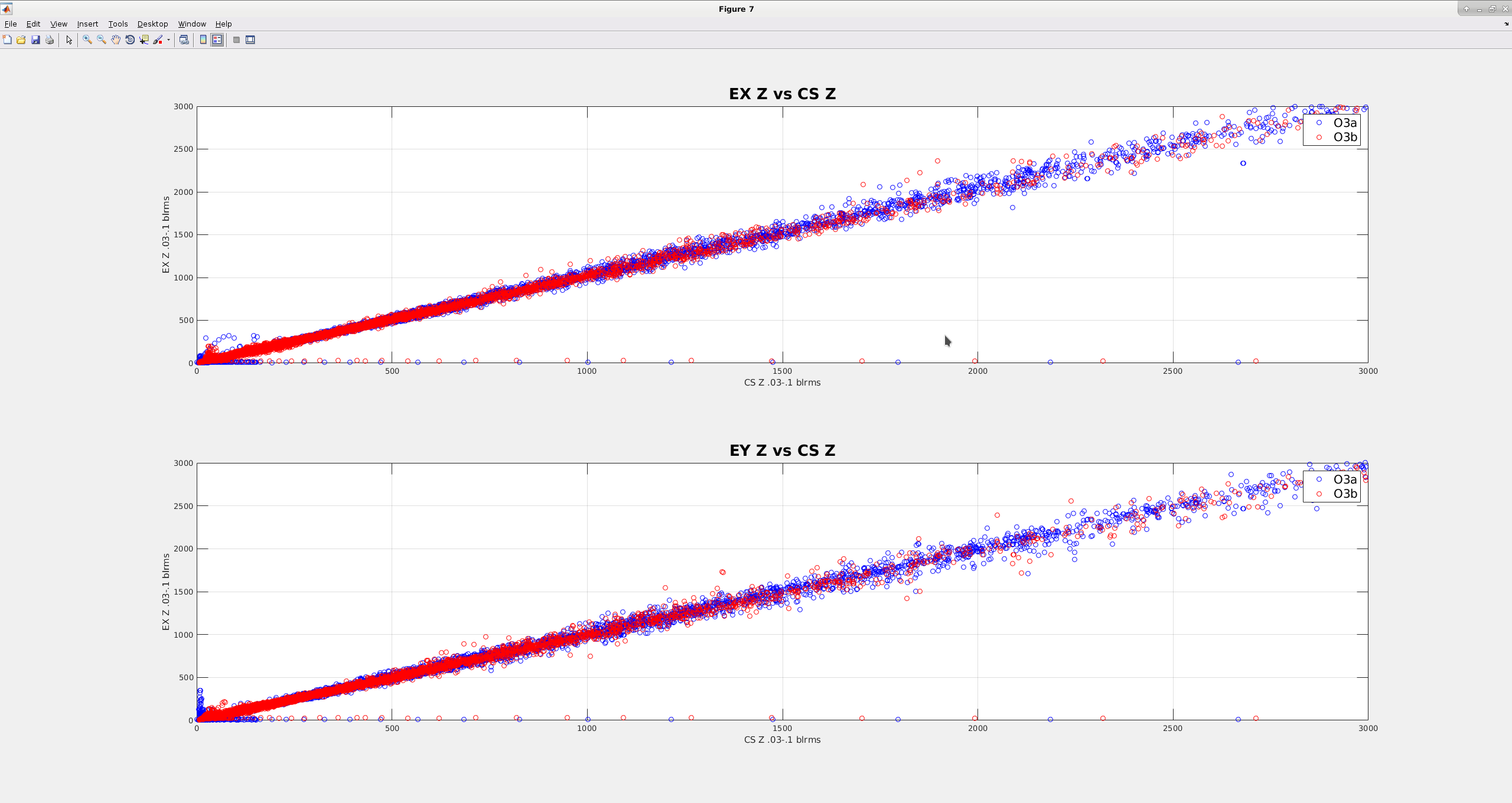
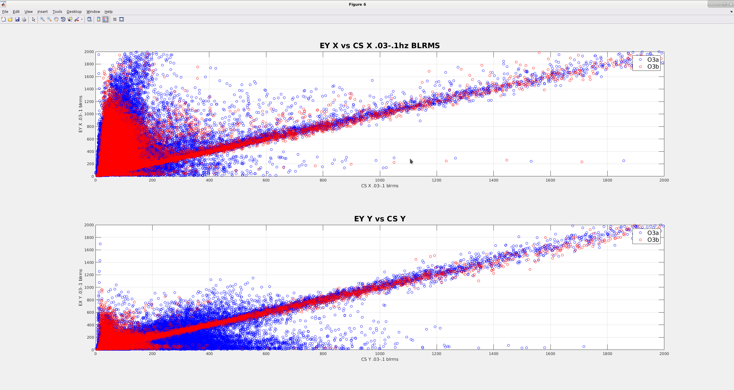
I've been staring at some data to see if the wind fences have had a measureable effect on building tilts at the end stations. I'm still working on this, but I have a couple interesting plots, that I think show that the low frequency motion is more correlated now after the wind fence went up, than before. Attached plots are kind of like scatter plots for the .03-.1hz blrms motion for the ITMY and ETMY seismometers, i.e. each point represents the corner station blrms motion on the X axis and the end station motion on Y axis. If each station were moving the exact same at the moment, all of the points would lie on a one-to-one line.
First plot compares the ITMY Z, ETMX Z and ETMY Z ground STS .03-.1hz blrms. The blue points are for O3a, before the fences went up, red is O3b, after the fence went up. Most of the data falls on a line of slope 1,suggesting the motion is related for this dof. Not suprising, because most of the motion in this direction at these frequencies has wavelengths many times the size of the site, so ends and corner are mostly moving together. Wind is more local, but doesn't show up in Z as strongly.
Second plot compares the X&Y for ITMY and ETMY ground STS. Again, blue points are O3a, red is O3b. Since the fence went up, the X&Y blrms now lie more on the 1 to 1 slope than they did before October. I would expect that if wind were still the strongest effect on the low frequency motion, the red lines would have stayed more "blobbish" in the lower right of the plot, for lower velocities. This is especially noticeable in the Y dof, which makes sense, given the orientation of the fence at EY. The fence will do a good job blocking winds coming from IFO +Y, and not at all for winds coming along X. Keep in mind the winds in the past 2 months have been much worse than during the entire O3a part of the run. It would instructive to run this on a similarly windy time prior to O3.
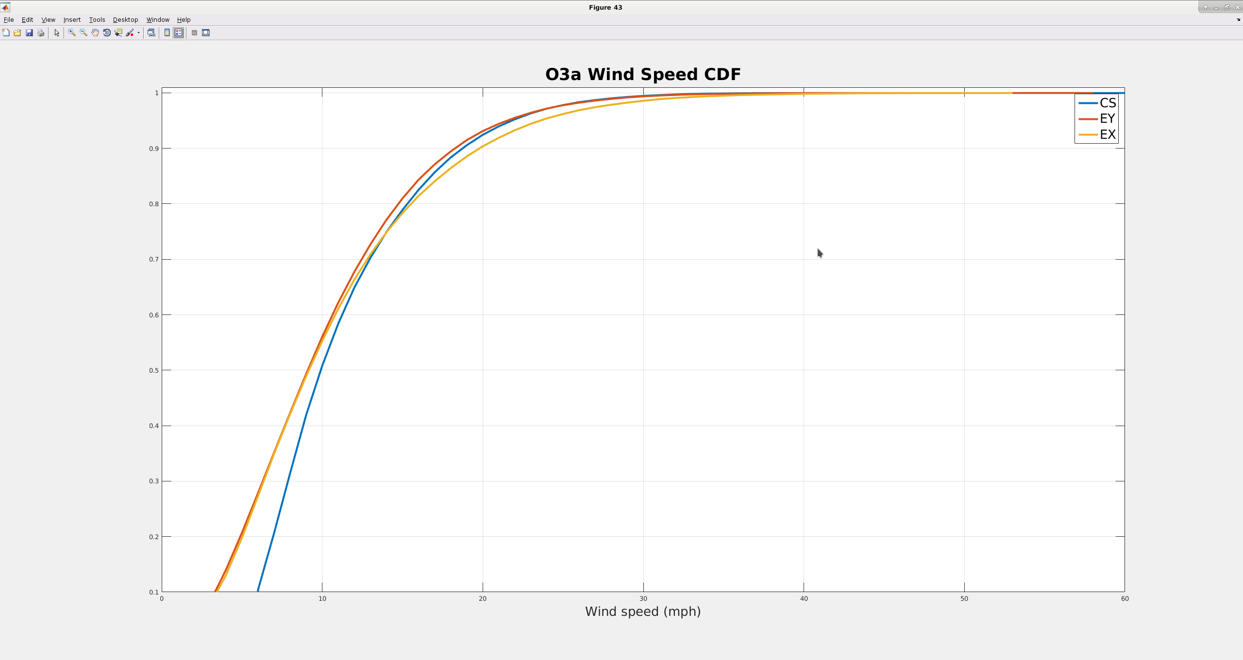
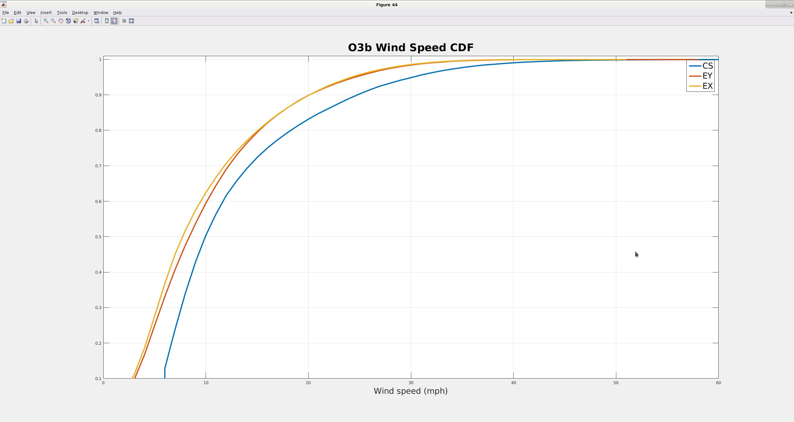
I'm attaching plots comparing the cumulative distributions of the winds for the 2 end stations and the corner. For these distributions, I had to look at times when the corner station was above 5mph. I think this makes sense, because higher winds will tend to be more sustained. The distributions tended to be kind of dominated by the lower winds, making it hard to tell the difference between the distributions above ~95%.
For O3a (first image), the distributions for the 3 buildings are pretty similar, especially above ~10 mph. The 50% level is about 10mph for the corner, maybe 9mph for the ends. The 90% level is just shy of 20mph for all 3 buildings
For O3b (second image), there is more of a consistent difference between distributions for the ends and the corner. And the distributions are toward lower wind speeds for the ends, again suggesting that the wind fences are having the impact on wind speeds at the buildings that we want. Again, the corner 50% level is about 10 mph, the ends are maybe 8 mph. The 90% level for the corner is now about 25 mph ( an increase of 5mph, reflecting the rather windy winter we've been having), while the ends are still right at 20 mph.